

Neutral decorating has moved beyond the idea that every surface should be white, gray, or beige. The more livable version includes color, but color that behaves quietly: tobacco brown, faded green, dusty blue, oxblood, clay, and soft yellow grounded by natural materials. The room reads as calm because the relationships are controlled, not because pigment is absent.
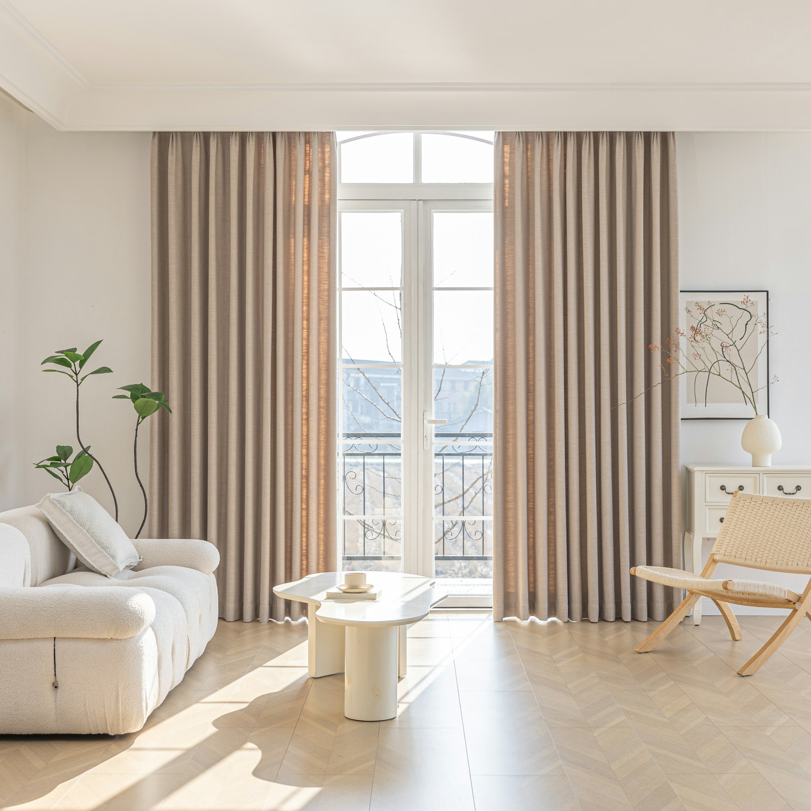
This approach is useful for anyone who likes color in photographs but feels overwhelmed when trying it at home. The answer is not to buy a matching collection. It is to establish a steady background, choose a limited family of supporting colors, and vary texture and value more than hue.
Neutral is a role, not a color name
A neutral is whatever allows other elements to coexist without demanding constant attention. In one room, olive can function as a neutral because it repeats in upholstery, art, and the view outside. In another, navy cabinetry provides the stable background while pale wood and cream remain accents.
Look at what cannot easily change: flooring, stone, fixed cabinetry, and major upholstery. Identify their undertones. A floor may lean red, yellow, gray, or orange. Instead of fighting it, select adjacent materials that acknowledge it. A warm oak floor often feels more resolved with cream and earthy green than with icy white and blue-gray.
Photograph the room in daylight and compare the fixed finishes side by side. This is more reliable than choosing paint in a store, where surrounding colors and lighting are different.
Build a palette from an existing object
Start with something you genuinely like and intend to keep: a rug, textile, artwork, ceramic piece, or even the colors in a landscape outside the window. Choose one pale background tone, one mid-tone, one dark anchor, and one restrained accent from it.
The background belongs on the largest surfaces. The mid-tone can appear in upholstery, curtains, or a rug. The dark anchor gives furniture legs, frames, lamps, or shelving definition. The accent should occupy the least area but appear in more than one location.
This is not a rigid percentage formula. A north-facing room, high ceiling, and large window will change how much color feels comfortable. Use the structure as a starting point and judge the actual room.
Control value before hue
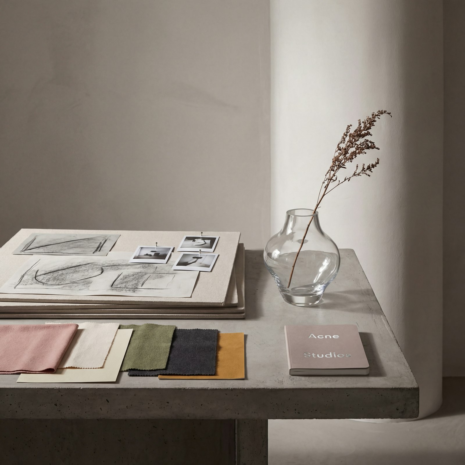
Rooms feel chaotic when many objects carry equal visual weight. Value—the relative lightness or darkness of a color—helps establish order. If walls, sofa, rug, curtains, and tables are all similar mid-tones, the room can appear flat even when the hues are tasteful.
Include a meaningful dark value and a light value. A charcoal lamp, deep wood table, or dark frame can sharpen a pale room. Conversely, a cream shade or light linen curtain can give a darker palette breathing space. Repeat the darkest note in several small places rather than concentrating it in one isolated object.
Convert a room photograph to grayscale on a phone to see the value structure without being distracted by color. If everything merges, adjust contrast before adding another hue.
Let texture carry part of the interest
When color is restrained, texture prevents the room from looking unfinished. Combine surfaces that respond differently to light: matte plaster or paint, visible wood grain, woven fabric, smooth ceramic, aged metal, and a little glass. The contrast can be subtle.
Avoid purchasing a dozen heavily textured objects. One nubby sofa, deep-pile rug, chunky throw, boucle chair, and slatted wall can compete just as much as bright colors. Give each major texture a quieter neighbor. Smooth linen balances rough wood; a flatweave rug can support a softer upholstered chair.
Natural variation is especially useful. Wood, stone, wool, linen, and handmade ceramics introduce small shifts in tone that make a limited palette feel less manufactured.
Use muted color where it can be repeated
Muted does not mean dull. It means the color is softened enough to sit beside other materials without becoming the entire subject. Sage, brick, ochre, and dusty blue are popular because they connect easily to wood, leather, stone, and plant life.
Repeat a chosen color at different strengths. A deep olive cushion, gray-green art detail, and a plant do not match exactly, yet they read as a family. Exact matching can look commercial; unrelated color can look accidental. Variation within a narrow range produces depth.
For expensive pieces, choose colors you have enjoyed over time rather than the season's most promoted shade. Trend color is easiest to use on paint, art, or a small textile that can change without waste.
Pattern needs a change of scale
Pattern works in a neutral room when not every pattern has the same density. Pair one larger, open motif with a small geometric or narrow stripe. Add a solid area between them. The eye needs places to rest.
Keep a common color running through different patterns. A floral cushion and striped curtain can coexist if both contain the room's background tone. Patterns from different traditions can also mix successfully when their values and scale are balanced.
Before ordering, arrange samples in the room at the distance from which they will be seen. A delicate print that looks distinct in hand may disappear across the room, while a high-contrast check can become far more dominant than expected.
Paint requires a real-room test
Paint undertones change with orientation, daylight, bulbs, flooring, and adjacent colors. Apply generous samples on movable boards or several walls and observe them through the day. A tiny chip against a white card exaggerates the color's contrast and is not enough evidence.
Do not assume all whites are neutral companions. A blue-white trim can make a warm beige wall look yellow; a creamy white can make a cool gray look purple. Compare them directly with fixed finishes.
Finish affects perception too. Higher sheen reflects more light and reveals surface flaws. Follow the manufacturer's recommendations for the room and substrate, and prepare the surface properly rather than expecting color to hide damage.
Keep the visual field disciplined
Color clutter is often object clutter. A coordinated palette cannot calm dozens of small items distributed evenly around a room. Group related objects, conceal practical supplies where convenient, and allow some surfaces to remain mostly open.
Books do not have to be arranged by color, and personal collections do not need to disappear. Instead, give them a boundary: one cabinet, a pair of shelves, or a tray. Repetition of containers can make varied contents feel deliberate without turning a home into a showroom.
Use frames and mats to connect unrelated art. A common frame finish or consistent spacing creates order even when the images span several colors and eras.
Avoid the matching-set shortcut
Buying every textile and accessory from one collection guarantees coordination but can remove the tension that makes a room interesting. Introduce items at different ages and finishes. A contemporary sofa, old wood side table, simple modern lamp, and handmade bowl can share a palette without sharing a catalog page.
When adding a piece, ask whether it brings a missing function, shape, texture, or value. If it merely repeats what is already present, leave it out. A room becomes collected through selective difference, not indiscriminate variety.
Edit under the room's actual light
Live with the palette before finishing every corner. Evening light may reveal that the room needs a darker anchor. Winter daylight may make the wall cooler than expected. Remove one element when a new one arrives and compare photographs over time.
The new neutral room is not a trend checklist. It is a method for making color easier to live with. Anchor the room in its fixed materials, vary light and dark, repeat muted hues, and let texture provide quiet complexity. The result can be colorful without being loud and calm without becoming anonymous.
Sources and further reading
- U.S. Environmental Protection Agency, indoor air quality when renovating: https://www.epa.gov/indoor-air-quality-iaq
- Federal Trade Commission, environmental marketing claims: https://www.ftc.gov/business-guidance/resources/environmental-claims-summary-green-guides