

Coastal rooms are often sold as a collection of recognizable symbols: navy stripes, rope, driftwood, shells, and a photograph of the sea. Those details can be charming, but a room assembled from all of them may feel like a holiday rental rather than a home. The quieter version takes its cues from what living near water actually involves—strong light, shifting weather, natural texture, easy cleaning, and a relaxed relationship with imperfect finishes.
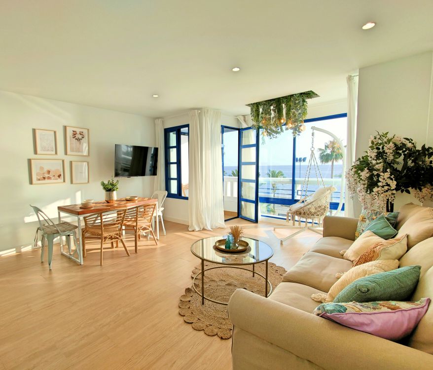
You do not need an ocean view to use those ideas. The point is not to pretend the house is somewhere else. It is to make rooms feel open and comfortable without losing the practical needs of the people who use them.
Start with the light you have
A coastal-inspired room often feels airy because light can travel across it. Before changing paint, look at curtains, furniture placement, and window cleanliness. Heavy window treatments or a tall cabinet across a window may be doing more to darken the room than the wall color.
Choose window coverings that manage glare and privacy while allowing useful daylight. Sheer fabric alone may not provide privacy after dark. A layered treatment—light-filtering panels plus a blind, for example—can be more flexible than either alone.
Not every room should be painted stark white. North-facing light can make it feel chilly, while a warm off-white, pale sand, soft gray-green, or muted clay may look more natural. Sample large areas and observe them morning and evening.
Let the local landscape guide color
The coast is not one shade of blue. It can include weathered grasses, dark wet stone, salt-white foam, reddish cliffs, olive scrub, and gray skies. Choose a small palette inspired by a landscape you actually like, rather than a generic resort image.
Use the palest tone across larger surfaces, one mid-tone in upholstery or curtains, and a darker note for contrast. A room with cream walls, oak furniture, olive cushions, and charcoal frames can read as coastal without a single seashell. If blue is a favorite, allow it to vary from faded gray-blue to deeper ink rather than matching every accessory.
Repeat colors in more than one location, but do not force exact matches. Natural variation is part of the appeal. A stripe in a rug and a small note in art may be enough to connect the palette.
Choose texture over themed objects

Woven linen, cotton, rattan, seagrass, pale or weathered wood, matte ceramic, and stone offer visual interest without announcing a theme. Mix coarse and smooth surfaces so the room does not become uniformly rough.
Texture must suit its job. An open weave on a sofa may catch pet claws. A seagrass rug can be difficult to clean after a spill. An unsealed wood table may show water rings. Use the material where its strengths make sense rather than because it appears in a styled photograph.
One substantial woven pendant or basket often has more impact than several small decorative ropes and knots. Leave room for objects that come from the household's real life.
Keep furniture easy to use
Coastal style looks relaxed when seating invites people to sit normally. Slipcovered sofas are popular because they appear informal, but check whether the covers are actually washable and whether they are easy to remove and replace. A zippered cover is not automatically machine washable.
Solid wood, quality veneer, and painted furniture can all work. Mixing finishes gives the room depth: pale oak with a darker vintage table, for instance, is more convincing than a complete matching suite labeled “beach house.”
Choose tables with enough space for drinks and books. A room can look open in photographs yet frustrate daily use if every surface is tiny and decorative.
Edit the nautical references
There is no rule against a maritime chart, striped textile, or shell collected on a trip. The issue is accumulation. Select one object with personal meaning and let it be specific. A framed photograph from a real visit carries more weight than three generic prints of anchors.
If you use stripes, vary their scale or pair them with solids. High-contrast navy stripes can dominate a small room; a faded ticking stripe may feel quieter. A single striped cushion and a subtle patterned rug can be enough.
Avoid arranging every object as evidence of the theme. Good rooms usually contain a few things that do not fit neatly into a category—an inherited chair, a bright book, or art from another place.
Make the entry and living area resilient
The useful side of coastal design is preparedness for sand, wet shoes, strong sun, and open windows. Even far from water, an entry mat that can be cleaned, a place for damp coats, and a durable floor finish are practical improvements.
In the living room, consider upholstery with documented care instructions and a rug appropriate to the traffic. Light colors do not have to be fragile, but they do require a realistic cleaning routine. Test fabric samples in the room before ordering and view them under daytime and evening light.
Sunlight can fade textiles and art. Move or shade vulnerable pieces as needed rather than assuming every “outdoor-inspired” material is UV-resistant indoors.
Include darker anchors
All-white rooms with pale wood can lose definition. A dark side table, aged bronze lamp, black picture frame, or deep green chair gives the eye a place to rest. The darker element should appear more than once, though not necessarily in equal amounts.
This also makes a room easier to maintain visually. Every small mark on a very pale surface attracts attention; varied tones and textures distribute that attention. A coastal palette can be moody and still feel open when light, circulation, and material balance are handled well.
Do not confuse brightness with a lack of contrast. A pale wall behind a dark wood cabinet can emphasize the cabinet's shape without closing the room in.
Use plants and found objects thoughtfully
Plants can connect an interior to the landscape, but choose them for the actual light and household. A plant that requires bright sun will not thrive in a dim corner because its leaves suit the palette. Consider pet safety and maintenance.
Found shells, stones, and driftwood can be meaningful souvenirs. Clean and display them in a small grouping, and follow local rules before collecting natural materials. Avoid making the room depend on a large quantity of objects taken from a sensitive habitat.
Handmade ceramics or a simple vase with branches can provide the same organic feeling without imitating the shore directly.
Think about sound and air
Hard surfaces and bare windows can make an “airy” room echo. Curtains, rugs, upholstered furniture, and books soften sound. That is part of livability, not a compromise to the look.
Ventilation is valuable, but opening windows is not always appropriate during high humidity, pollution, or pollen. Address leaks and dampness rather than relying on fragrance or decorative dehumidifiers. Materials should be kept dry according to their care needs.
Lighting after dark matters as much as daylight. A few low, warm sources can preserve the room's easy character when the view outside disappears. Check bulb and fixture compatibility.
Buy less, but choose more deliberately
The temptation is to refresh every accessory at once. Instead, work from the largest elements: wall color, window treatment, rug, seating, and light. Reposition existing furniture and remove themed clutter before buying anything. A room may need a larger rug and a better lamp, not twelve new cushions.
Secondhand wood furniture and handmade objects can bring variation at a reasonable cost. Inspect condition and care requirements. There is no benefit in buying a “rustic” item that is unstable or difficult to clean.
Let the room evolve. A coastal sensibility is compatible with objects gathered over years; a catalog-perfect set is not the only route to cohesion.
A room that feels like a place, not a theme
The most livable coastal style is an approach to atmosphere: useful daylight, materials with visible texture, a limited palette drawn from nature, comfortable furniture, and enough restraint for personal objects to matter. Blue and white can be part of it, but they do not define it. When the room works on a rainy Tuesday as well as a sunny holiday, the style has become part of a home rather than a costume.
Sources and further reading
- U.S. Environmental Protection Agency, moisture and indoor air: https://www.epa.gov/mold/brief-guide-mold-moisture-and-your-home
- Federal Trade Commission, environmental marketing claims: https://www.ftc.gov/business-guidance/resources/environmental-claims-summary-green-guides